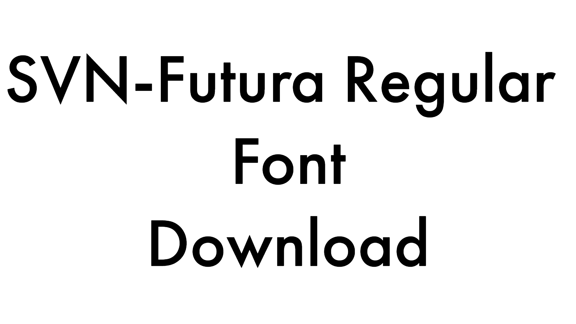
Linotype Didot Font
Font Information
Linotype Didot Pro
| Designer | Adrian Frutiger; Linotype Design Studio |
|---|---|
| Copyright | Copyright © 2014 Monotype GmbH. All rights reserved. |
| License | Personal Use |
| Description | For about 100 years in the eighteenth and nineteenth centuries, several members of the Didot family were active in Paris as designers. They were also printers, publishers, typefounders, inventors, writers and intellectuals. Around 1800, the Didot family owned the most important print shop and font foundry in France. Pierre Didot published books and prints set in typefaces designed and punchcut by his brother, Firmin Didot. The statuesque, clear forms of the Didot alphabets are representative of the time, and are quite similar to those designed by Giambattista around the same time in Italy. These types are in the style known as ""modern"" – meaning they are characterized by extreme vertical stress and fine hairlines contrasted by bold main strokes. Linotype Didot was drawn by Adrian Frutiger in 1991, and is based on the fonts cut by Firmin Didot between 1799 and 1811. Frutiger also studied the Didot types in a book printed by the Didots in 1818, ""La Henriade"" by Voltaire.Linotype Didot is the right choice for elegant book and magazine designs, as well as advertising with a classic touch. |
| Version | 1.000 Build 1000 |
Font Styles Included (4):
DidotLTPro-Bold.ttf
Weight: Regular
Glyphs: 427
Weight: Regular
Glyphs: 427
DidotLTPro-Headline.ttf
Weight: Regular
Glyphs: 500
Weight: Regular
Glyphs: 500
DidotLTPro-Italic.ttf
Weight: Regular
Glyphs: 427
Weight: Regular
Glyphs: 427
DidotLTPro-Roman.ttf
Weight: Regular
Glyphs: 591
Weight: Regular
Glyphs: 591
Linotype Didot Pro
| Designer | Adrian Frutiger |
|---|---|
| Copyright | Copyright © 2012 Linotype GmbH, www.linotype.com. All rights reserved. This font software may not be reproduced, modified, disclosed or transferred without the express written approval of Linotype GmbH. Linotype Didot is a trademark of Linotype GmbH registered in the U.S. Patent and Trademark Office and may be registered in certain other jurisdictions. This typeface is original artwork of Adrian Frutiger. The design may be protected in certain jurisdictions. |
| License | Personal Use |
| Description | For about 100 years in the eighteenth and nineteenth centuries, several members of the Didot family were active in Paris as designers. They were also printers, publishers, typefounders, inventors, writers and intellectuals. Around 1800, the Didot family owned the most important print shop and font foundry in France. Pierre Didot published books and prints set in typefaces designed and punchcut by his brother, Firmin Didot. The statuesque, clear forms of the Didot alphabets are representative of the time, and are quite similar to those designed by Giambattista Bodoni around the same time in Italy. These types are in the style known as "modern" – meaning they are characterized by extreme vertical stress and fine hairlines contrasted by bold main strokes. Linotype Didot was drawn by Adrian Frutiger in 1991, and is based on the fonts cut by Firmin Didot between 1799 and 1811. Frutiger also studied the Didot types in a book printed by the Didots in 1818, "La Henriade" by Voltaire. This beautifully drawn family has 12 weights including Old style Figures, a headline version, and superb graphic ornaments. Linotype Didot is the right choice for elegant book and magazine designs, as well as advertising with a classic touch. |
| Version | 1.00 |
Font Styles Included (2):
DidotLTPro-BoldItalic.ttf
Weight: Regular
Glyphs: 426
Weight: Regular
Glyphs: 426
DidotLTStd-BoldItalic.ttf
Weight: Regular
Glyphs: 282
Weight: Regular
Glyphs: 282
Linotype Didot Std
| Designer | Adrian Frutiger |
|---|---|
| Copyright | Copyright © 2014 Monotype GmbH. All rights reserved. |
| License | Personal Use |
| Description | For about 100 years in the eighteenth and nineteenth centuries, several members of the Didot family were active in Paris as designers. They were also printers, publishers, typefounders, inventors, writers and intellectuals. Around 1800, the Didot family owned the most important print shop and font foundry in France. Pierre Didot published books and prints set in typefaces designed and punchcut by his brother, Firmin Didot. The statuesque, clear forms of the Didot alphabets are representative of the time, and are quite similar to those designed by Giambattista around the same time in Italy. These types are in the style known as "modern" – meaning they are characterized by extreme vertical stress and fine hairlines contrasted by bold main strokes. Linotype Didot was drawn by Adrian Frutiger in 1991, and is based on the fonts cut by Firmin Didot between 1799 and 1811. Frutiger also studied the Didot types in a book printed by the Didots in 1818, "La Henriade" by Voltaire.Linotype Didot is the right choice for elegant book and magazine designs, as well as advertising with a classic touch. |
| Version | 2.000 Build 1000 |
Font Styles Included (4):
DidotLTStd-Bold.ttf
Weight: Regular
Glyphs: 291
Weight: Regular
Glyphs: 291
DidotLTStd-Headline.ttf
Weight: Regular
Glyphs: 352
Weight: Regular
Glyphs: 352
DidotLTStd-Italic.ttf
Weight: Regular
Glyphs: 291
Weight: Regular
Glyphs: 291
DidotLTStd-Roman.ttf
Weight: Regular
Glyphs: 434
Weight: Regular
Glyphs: 434
Type your text
Preview Font Character Mapping
Loading and extracting font in browser...
Download Font Pack